This
website contained many fonts that were more decorative such as the twilight
font. I used it in a blog to show how typography can be branded. This applies
to the Harry Potter typeface and Disney.
Barolini,
Helen. Aldus and His Dream Book: An Illustrated Essay. New York:
Italica, 1992. Print.
Through Aldus and His Dream Book, I was able to gather multiple illustrations of Aldus’s works. There were multiple images of type specimens, and the captions were very descriptive when it came to describing what I was looking at.
Through Aldus and His Dream Book, I was able to gather multiple illustrations of Aldus’s works. There were multiple images of type specimens, and the captions were very descriptive when it came to describing what I was looking at.
Beaujon,
Paul. The Type Specimen of Jean Jannon. London: Maggs Bros, 1927. Print.
The Type Specimen of Jean Jannon included well documented typefaces designed by Jean Jannon. I was able to get multiple images of his work along with descriptions of the typeface. It also included some background information on Jannon that I was able to use for the project.
The Type Specimen of Jean Jannon included well documented typefaces designed by Jean Jannon. I was able to get multiple images of his work along with descriptions of the typeface. It also included some background information on Jannon that I was able to use for the project.
"Black
& White Typography €“Wonders
of Graphic Design." Graphic Design Blog An Ultimate Resource for
Graphic Designers. N.p., 25 Feb. 2009. Web. 05 Dec. 2012.
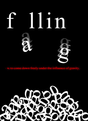
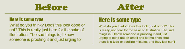
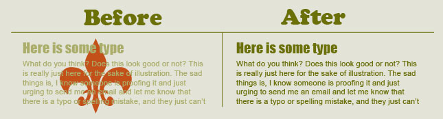
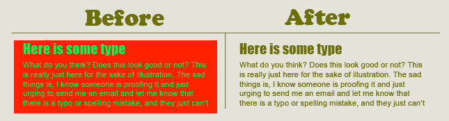
This blog had some really creative
ideas with the use of typography. I plan to continue following the blog to
inspire me on future projects. I actually ended up blogging the falling image
from this website.
Dodd,
Robin. From Gutenberg to Opentype: An Illustrated History of Type from the
Earliest Letterforms to the Latest Digital Fonts. Vancouver: Hartley &
Marks, 2006. Print.
From Gutenberg to Opentype was a book that provided a lot a good basic information. I began my research by first referring to this book. It included most of my designers, so I was able to get an understandment of each designer, and from there, I went on to deeper research. This was also one of the two books that helped me gather all of my research and put it in chronological order.
From Gutenberg to Opentype was a book that provided a lot a good basic information. I began my research by first referring to this book. It included most of my designers, so I was able to get an understandment of each designer, and from there, I went on to deeper research. This was also one of the two books that helped me gather all of my research and put it in chronological order.
Füssel,
Stephan. Gutenberg and the Impact of Printing. Trans. Douglas Martin.
Aldershot, Hampshire: Ashgate Pub., 2005. Print.
Fussel’s Gutenberg and the Impact of Printing provided very detailed information about Gutenberg’s background and invention of the moveable press. Because a lot of our topics that we wanted to cover referred back to Gutenberg, this book became very useful for that reason. This book also included multiple images of his work that was used in our final presentation.
Fussel’s Gutenberg and the Impact of Printing provided very detailed information about Gutenberg’s background and invention of the moveable press. Because a lot of our topics that we wanted to cover referred back to Gutenberg, this book became very useful for that reason. This book also included multiple images of his work that was used in our final presentation.
Hawthorne,
Eoyin. "Book Binding Part One." YouTube. N.p., 16 Aug.
2011. Web. 05 Dec. 2012.
This clip was used in my blog. I explained in
detail how to bind a book, and since this is a topic I find very interesting I wanted
it to share it with others.
Hlavsa,
Oldřich. A Book of Type and Design. London: Peter Nevill, 1960. Print.
Hlavsa’s A Book of Type and Design was extremely useful because it had a detailed timeline of all the type designers. This helped in the organization of the book. There were also immense chapters dedicated to each person, so it provided a lot of information especially for those designers who I couldn’t find a book dedicated to them.
Hlavsa’s A Book of Type and Design was extremely useful because it had a detailed timeline of all the type designers. This helped in the organization of the book. There were also immense chapters dedicated to each person, so it provided a lot of information especially for those designers who I couldn’t find a book dedicated to them.
LARS. "30 Logos with Good Ideas and Messages
You May Not See Directly." Tripwire Magazine. N.p., 8 May
2009. Web. 05 Dec. 2012.
This was website was used for my blog. I have
always found very witty the logos that have a hidden message. I then used pictures
from here to demonstrate my favorites.
Lehmann-Haupt,
Hellmut. Peter Schoeffer of Gernsheim of Mainz. Rochester: Printing
House of Leo Hart, 1950. Print.
Lehmann-Haupt’s book was the perfect resource when researching Peter Schoffer. It included everything from his college life to type specimens of his work. This allowed me to get all of the pictures used for Schoeffer from this source. This book even included handwritten notes from him.
Lehmann-Haupt’s book was the perfect resource when researching Peter Schoffer. It included everything from his college life to type specimens of his work. This allowed me to get all of the pictures used for Schoeffer from this source. This book even included handwritten notes from him.
Lowry,
Martin. Nicholas Jenson: And the Rise of Venetian Publishing in Renaissance
Europe. Oxford: B. Blackwell, 1991. Print.
Lowery’s
Nicholas Jenson: And the Rise of Venetian Publishing in Renaissance provided
much information on Jenson’s life. This book also included multiple pictures
which were used on the final book.
Hawthorne,
Eoyin. "Book Binding Part One." YouTube. N.p., 16 Aug.
2011. Web. 05 Dec. 2012.
This clip was used in my blog. I explained in
detail how to bind a book, and since this is a topic I find very interesting I wanted
it to share it with others.
"Phaistos
Disc." Wikipedia. Wikimedia Foundation, 12 Apr. 2012. Web. 05
Dec. 2012.
I was
really interested in the history of typography, so I decided to look it up. I
ended up using the Wikipedia page for information on that topic since it was
straight to the point. I used this information on my blog.
Sillich,
Chris. "V for Vendetta in Kinetic Typography." YouTube.
N.p., 4 Dec. 2007. Web. 05 Dec. 2012.
I was fascinated by the V for Vendetta kinetic typography that Chris Sillich created. I ended up using this for one of my blogs since I had never really thought about how much typography could really enhance a monologue since monologues are usually acted not read.
I was fascinated by the V for Vendetta kinetic typography that Chris Sillich created. I ended up using this for one of my blogs since I had never really thought about how much typography could really enhance a monologue since monologues are usually acted not read.
Vora,
Sonalia. "50 Years of Typography in Album Covers." Psdtuts.
N.p., 7 Dec. 2010. Web. 05 Dec. 2012.
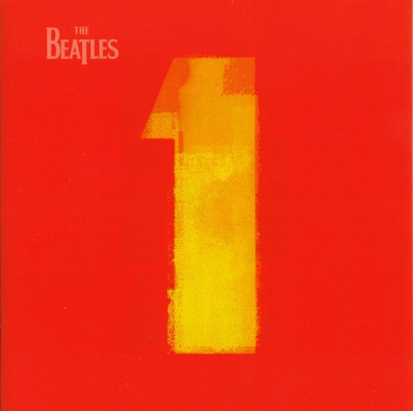
This website was perfect for my blog. I used some
pictures of past album covers to demonstrate how typography is crucial for
covers.